Bundled products on the bundle page
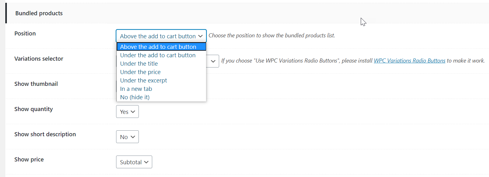
1/ Position:
Choose a position to display the list of bundled products in bundle page:
- Above Add to Cart button
- Under Add to Cart button
- Under the title
- Under the price
- Under the excerpt
- In a new tab
- No (hide it)
This is the default position where the list of bundled products appears on the bundle page.
If you want to adjust the position of bundle name on bundled products’ individual pages, choose an option in the “Bundles” section.

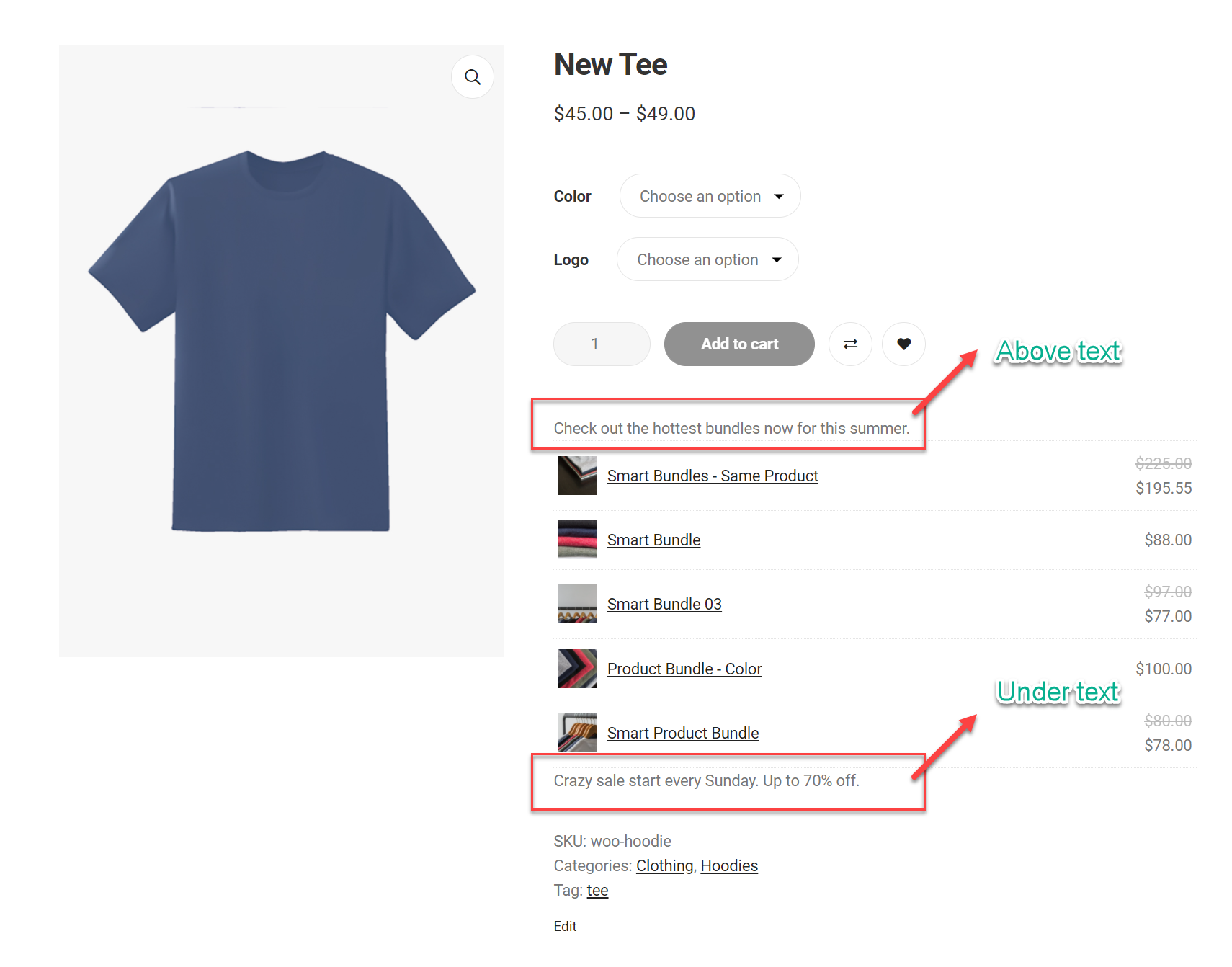
Where the list of all bundles that an individual product is included in appears:
2/Layouts:
In the plugin setting, the default layout is List. Users can choose another layout there for all bundles storewide:

To change the layout of specific bundles, you can choose a layout in the Bundled products tab of the bundle page:

3/ Variations Selector Interfaces:
WPC Product Bundles provides two kinds of selector interfaces:
- Default interface
- Use WPC Variations Radio Buttons
3.1/ Default interface:
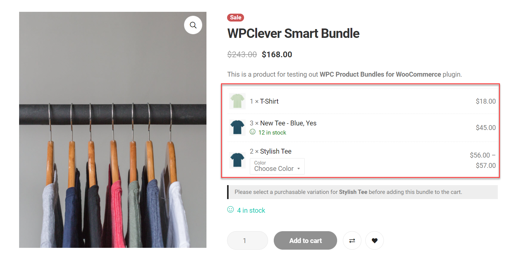
The default interface displays a drop-down for attributes of each variable product in a bundle (for example, product A has two attributes, there are 2 drop-down lists, one for Size, one for Color, see image below).

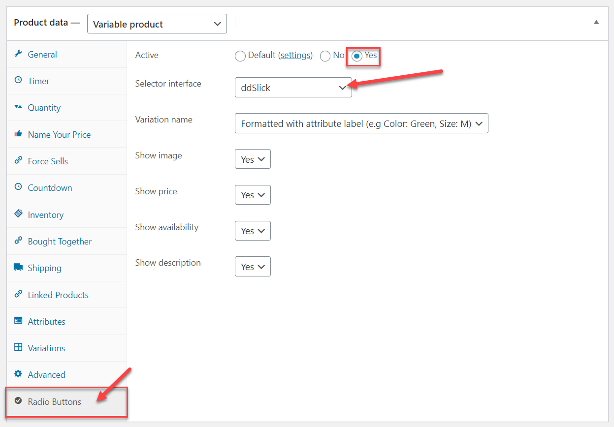
3.2/ Use WPC Variations Radio Buttons:
If you choose to display the radio buttons in the front-end, please install the WPC Variations Radio Buttons plugin first. Then, set things up in Radio Button plugin settings. WPC Variations Radio Buttons can also bring about ddSlick, Select2, and HTML tags interfaces to your bundle.